Living apart together in EnBloc
A socially inclusive city block in Amsterdam
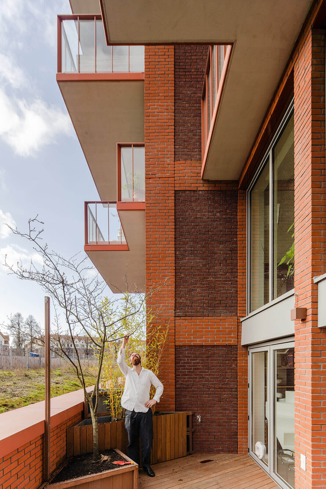
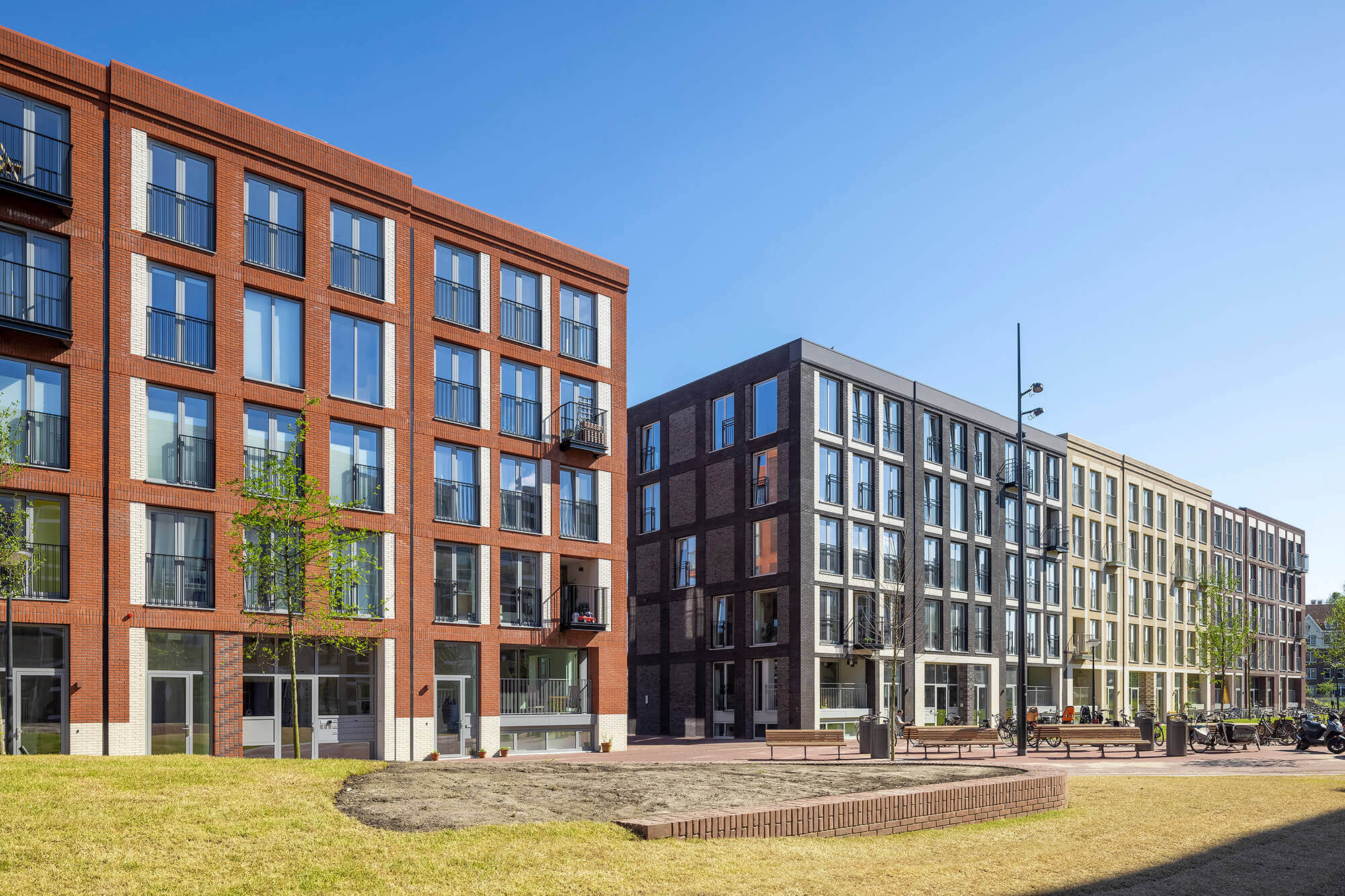
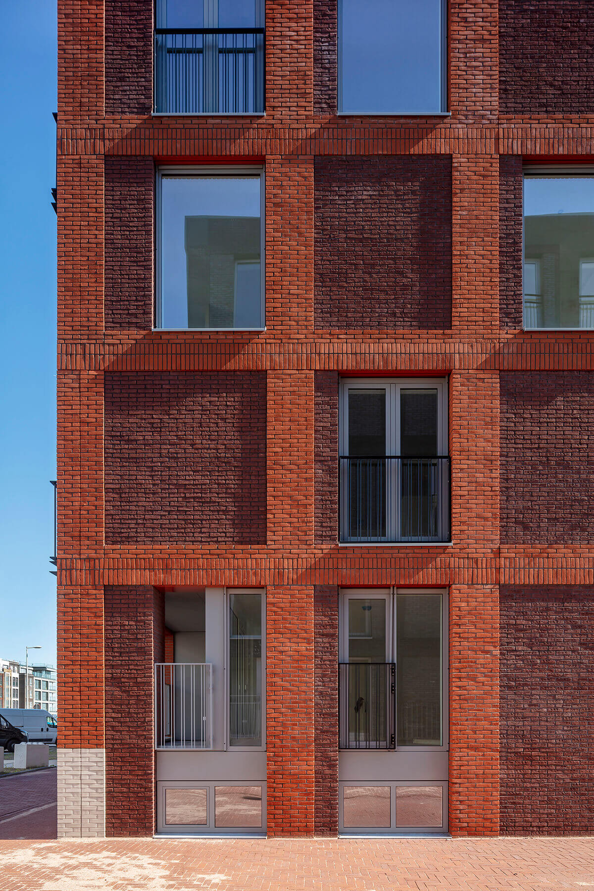
Create your own space together with your new neighbours. That is what residents have done, with the help of MKA, in EnBloc in Amsterdam. As co-creators, residents expressed their individual housing needs and also contributed their ideas about the layout of the building and collective facilities from the start of the project. Let’s take a look at the interiors of three of the very first residents to assess the result.
Jelmer’s diagonal walls
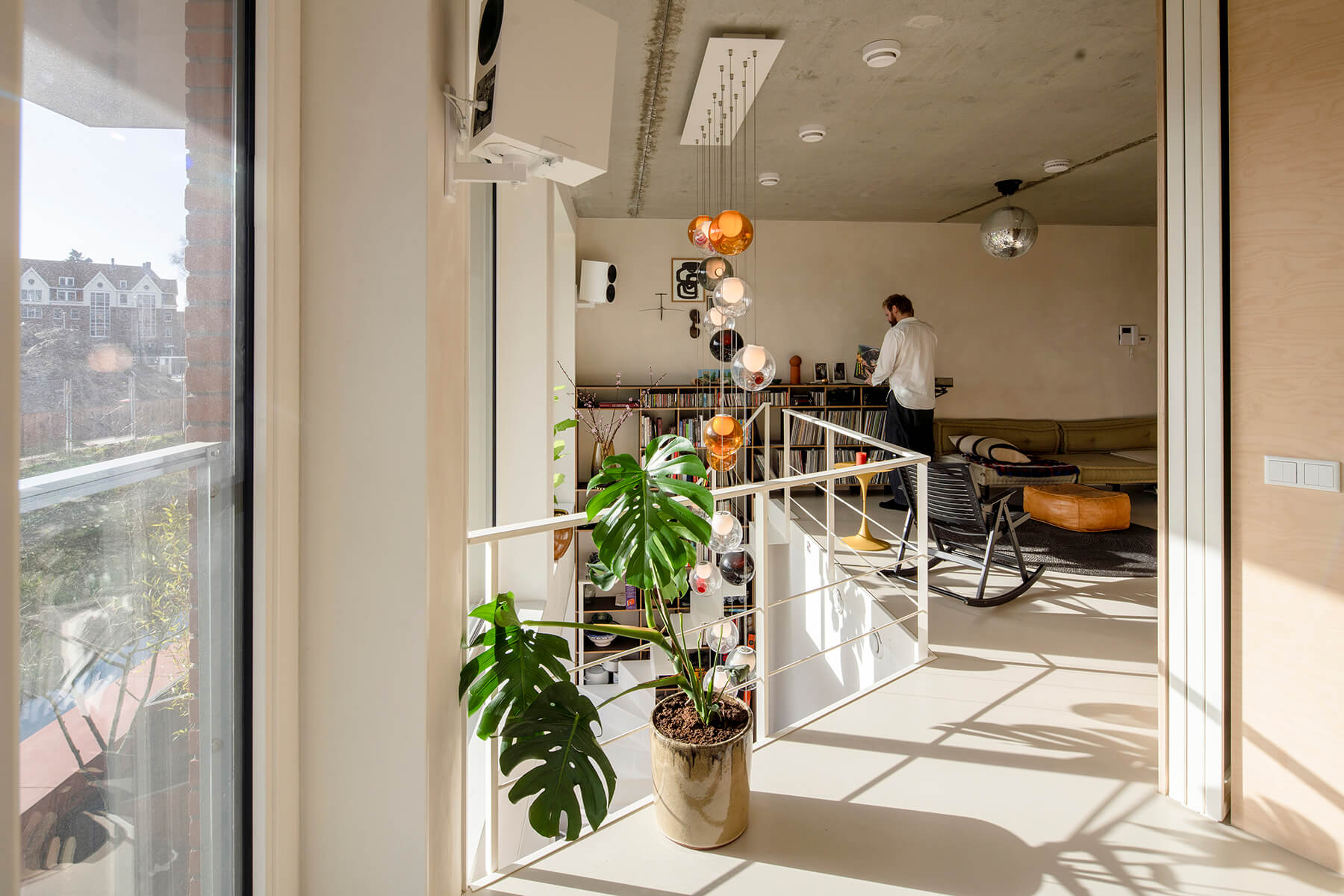
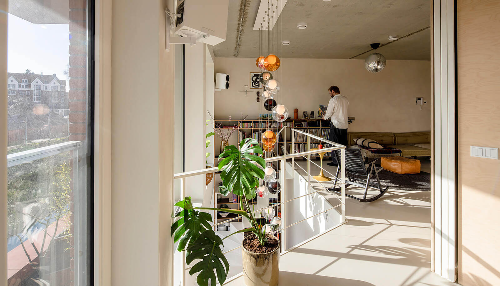
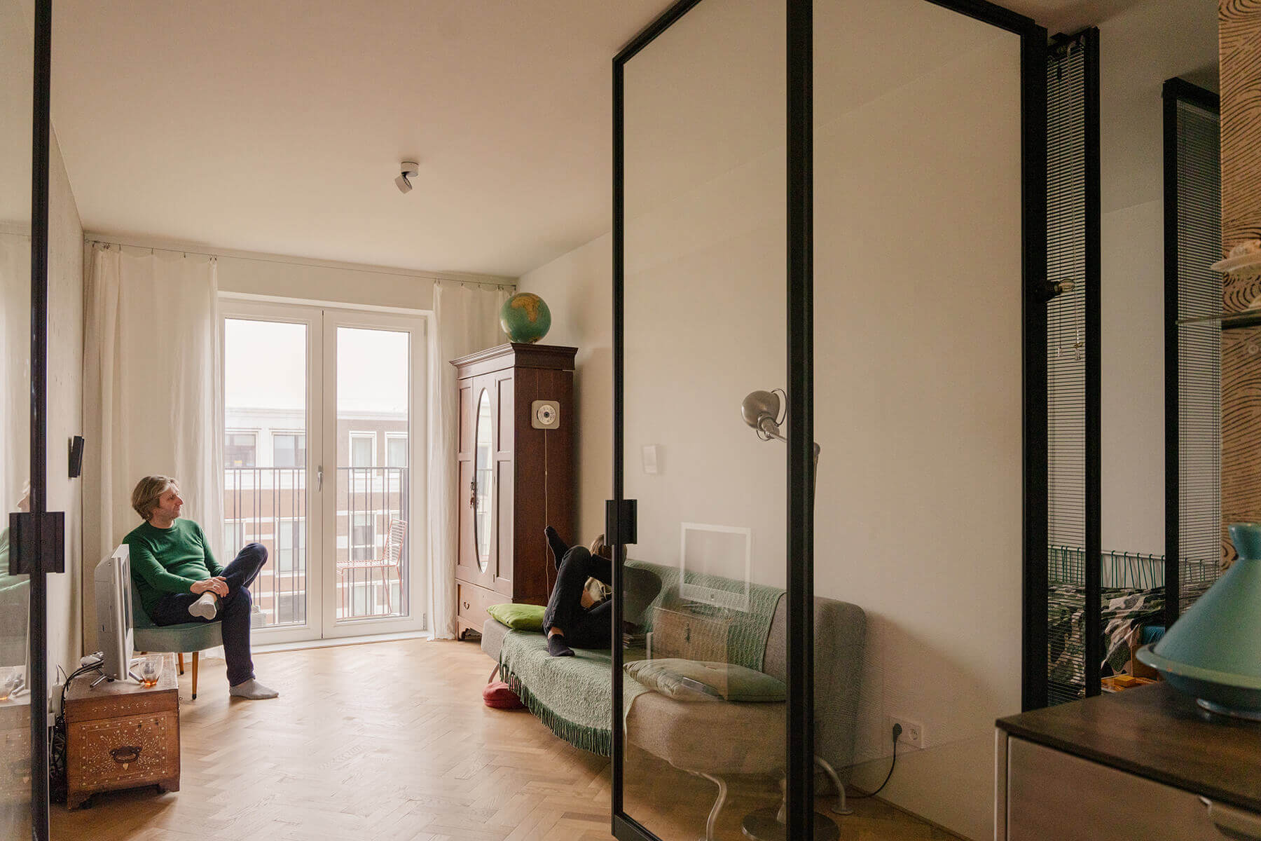
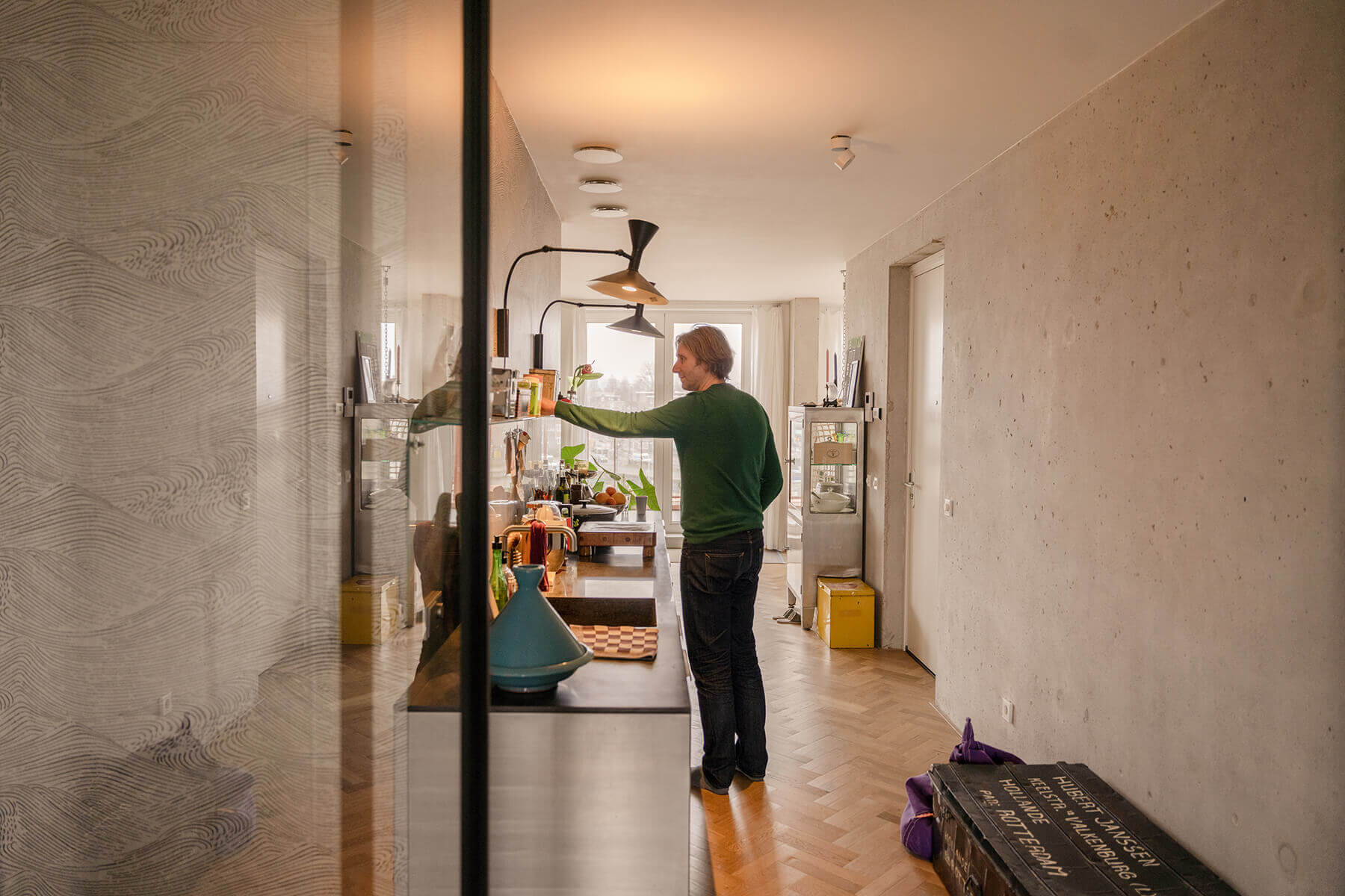
A return to Amsterdam, that was Jelmer’s main objective when he decided to get involved in Marc Koehler Architects’ EnBloc project in 2016. “I was looking for something on the water, with an outdoor space and I also wanted to have a say in my home’s layout. I ended up choosing one of the smallest apartments (62 m2) in the basement. In Haarlem I had twice as much space, but then I asked myself; do I really need all that space? My apartment in EnBloc was delivered as a bare shell, so I could fit it out to my own taste and needs. This allowed me to apply many of the Tiny House principles. It doesn’t feel small at all, and the layout is really efficient. A small house should be a little out of the ordinary, in my opinion.
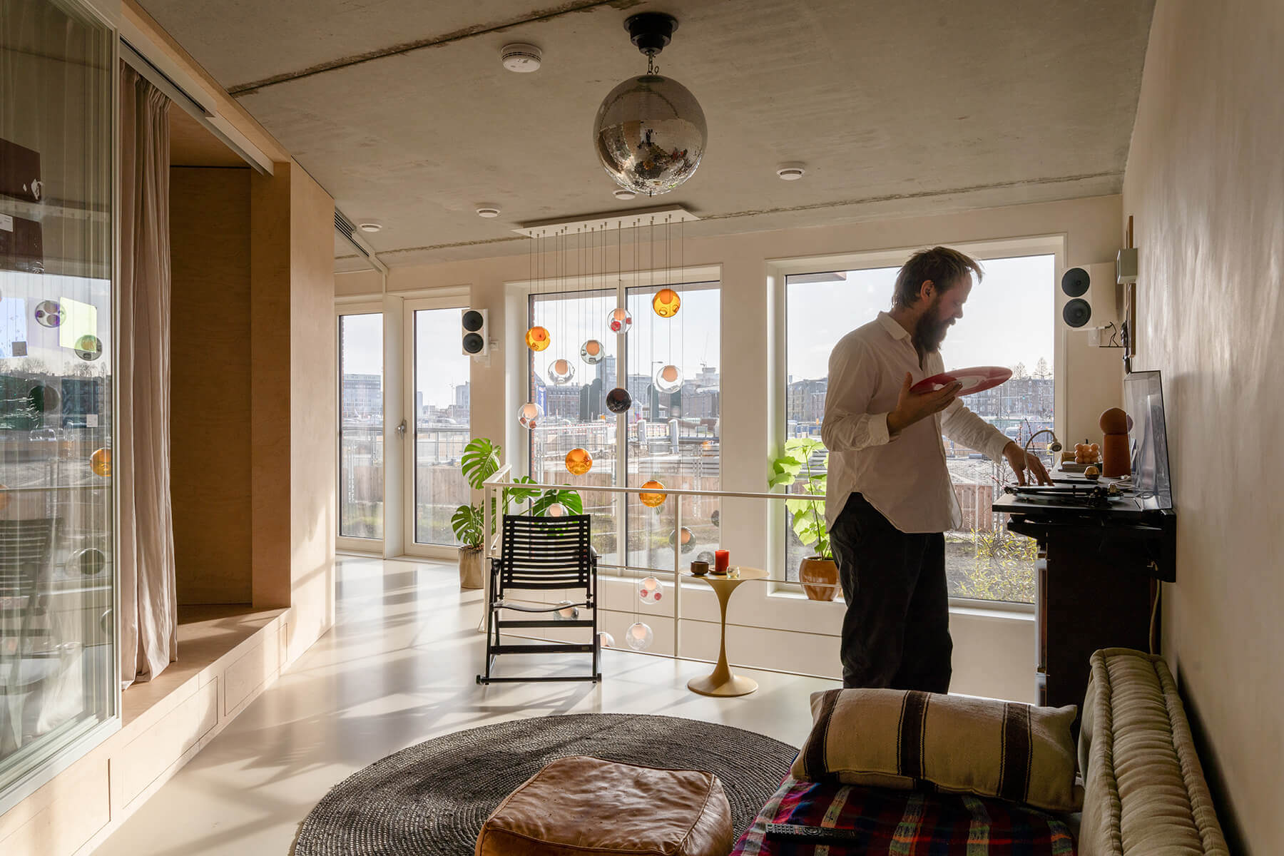
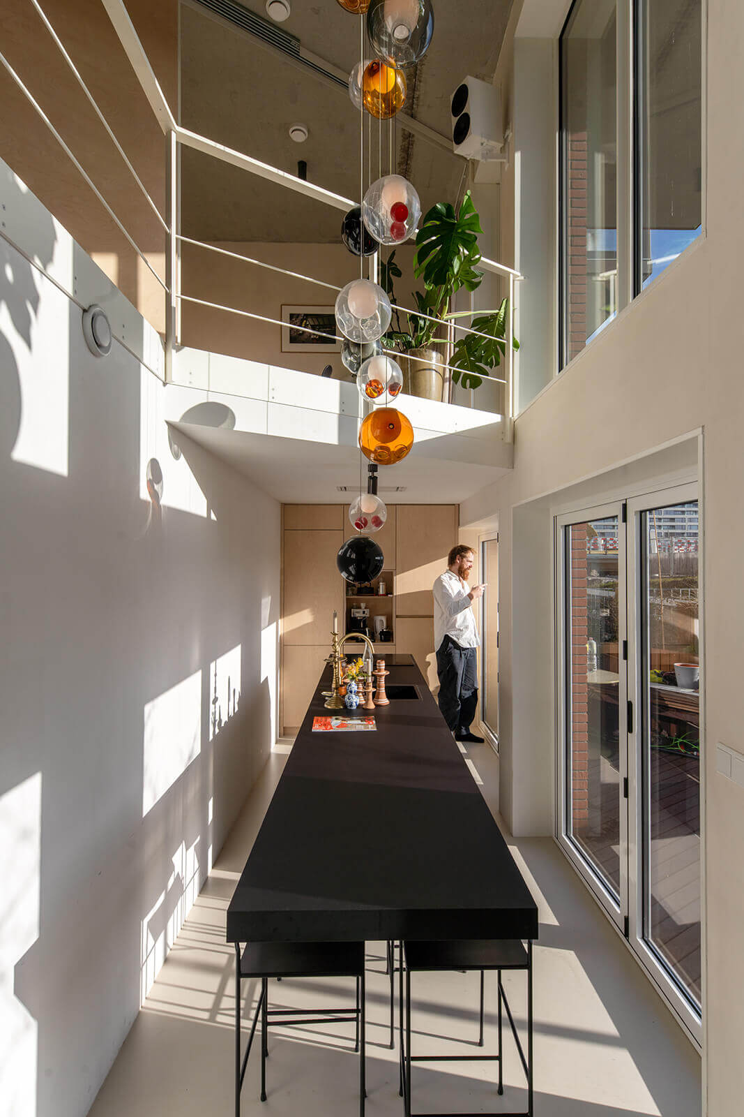
During one of the design sessions, Marc Koehler asked: ‘What do your days look like?’ For me, the weekends are the most important days; that’s when I have the most people with me in my home. During the week I am often alone and my life centres around the coffee machine and my music. So the spaces had to be made multifunctional, with flexible walls. Marc came up with the idea of a diagonal design. That felt strange at first, but when you look at it now, the result is perfect. It creates a sense of calm and restfulness. Every square metre is living space. The great thing about EnBloc is that the people living here wholeheartedly chose to do this and have worked towards that goal for years. We know each other personally and that creates a strong community feeling.”
Iwan’s glass L shape
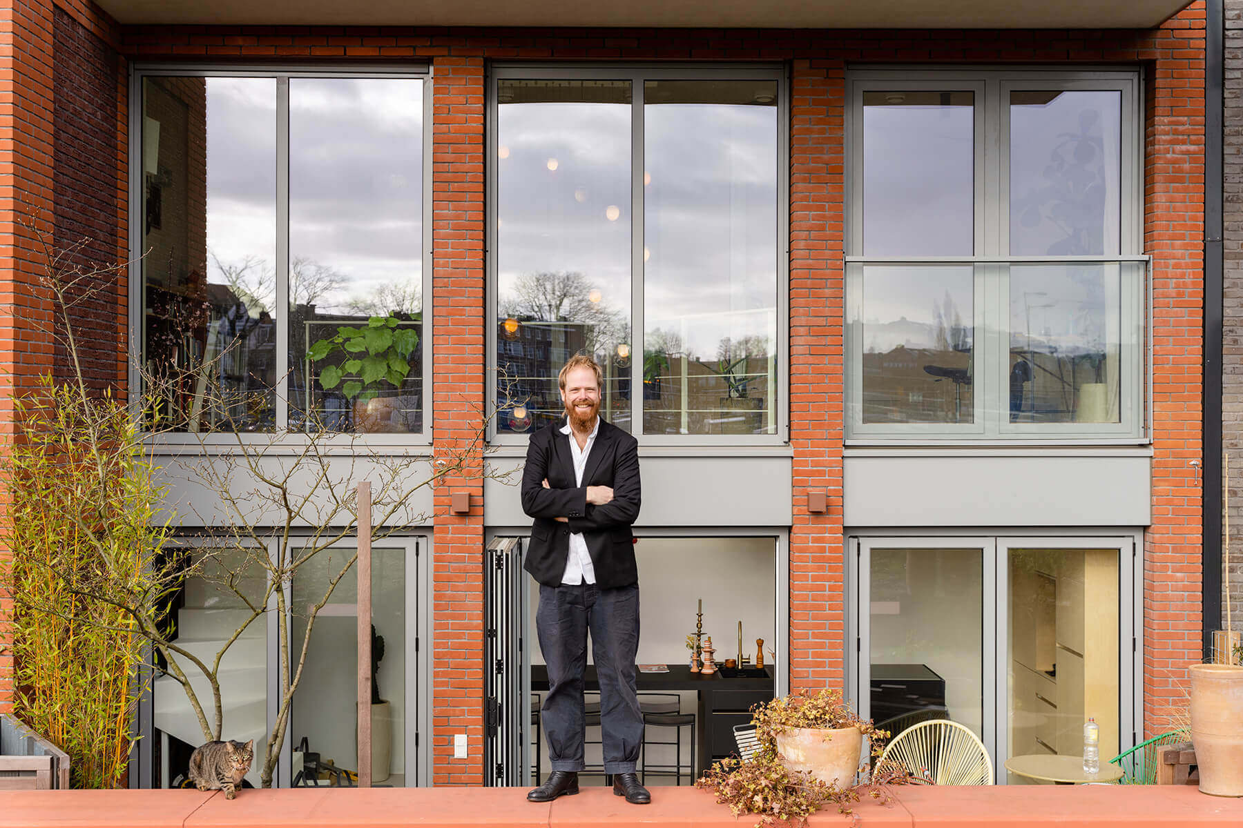
In his search for a ‘crazy’ apartment in a residential block, Iwan found the answer in EnBloc. “I felt it was time to leave the Brouwersgracht area. I wanted to live in a new place, have a say in my own home and I wanted to get to know my new neighbours beforehand. When I chose an apartment on the top floor, I could see from the floor plan that it was well laid out for what I wanted. The apartment is shaped like an L and consists of three units. Two looking out over the waterfront and one looking onto the park. On the waterfront side, there is a rooftop balcony that runs the entire length of the house: 15 metres. That creates a real loft apartment feeling. The core is located in the middle of the apartment and you can walk around it. I like openness and a feeling of contact in my home. The bedrooms are all glass, like fish bowls. In our home, you can see everything, only the bathroom has an opaque door. All that light makes the home a source of Vitamin D. I just love it.”
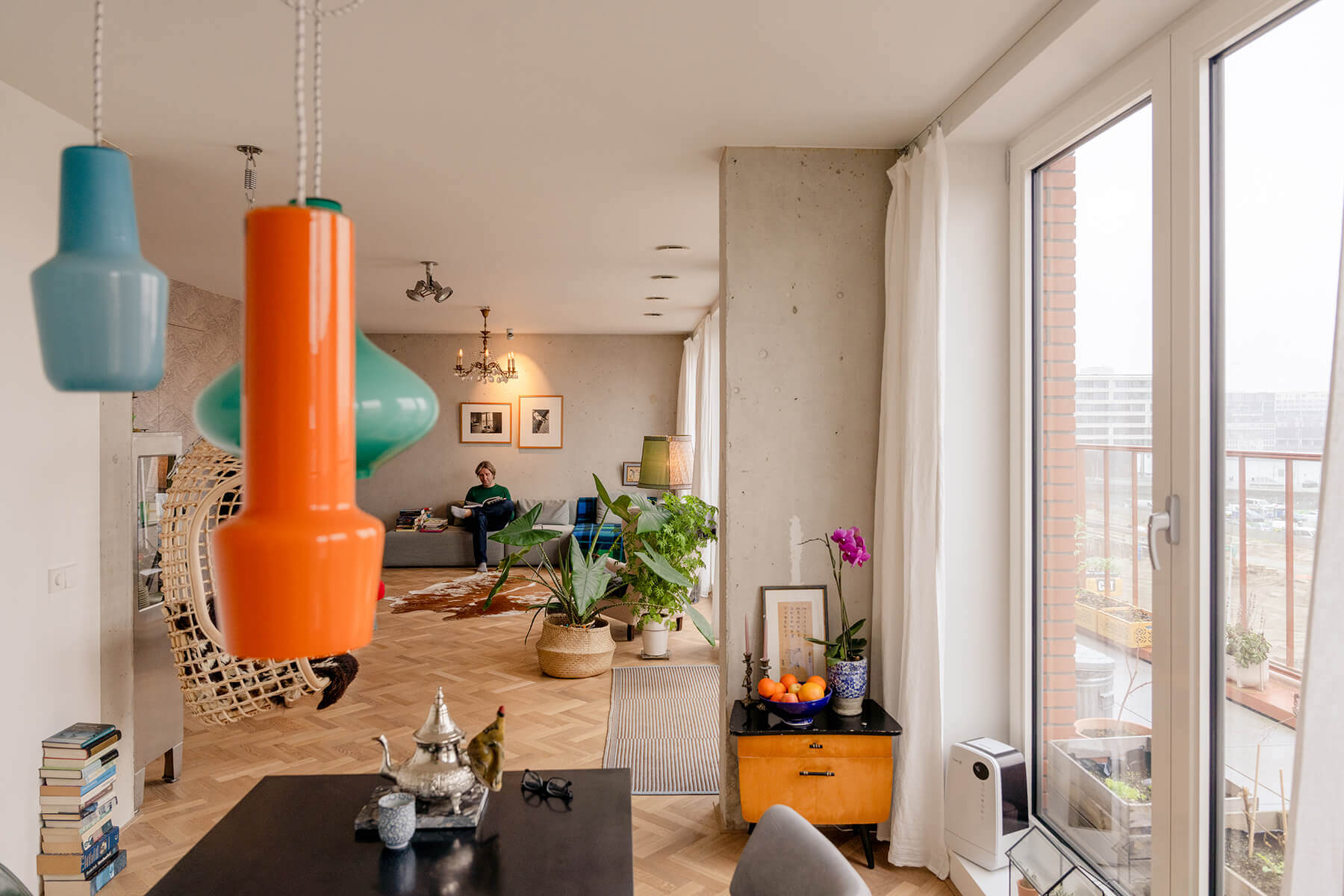
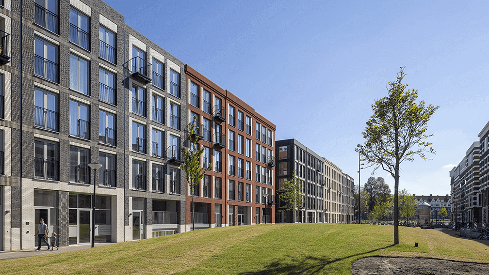
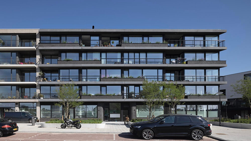
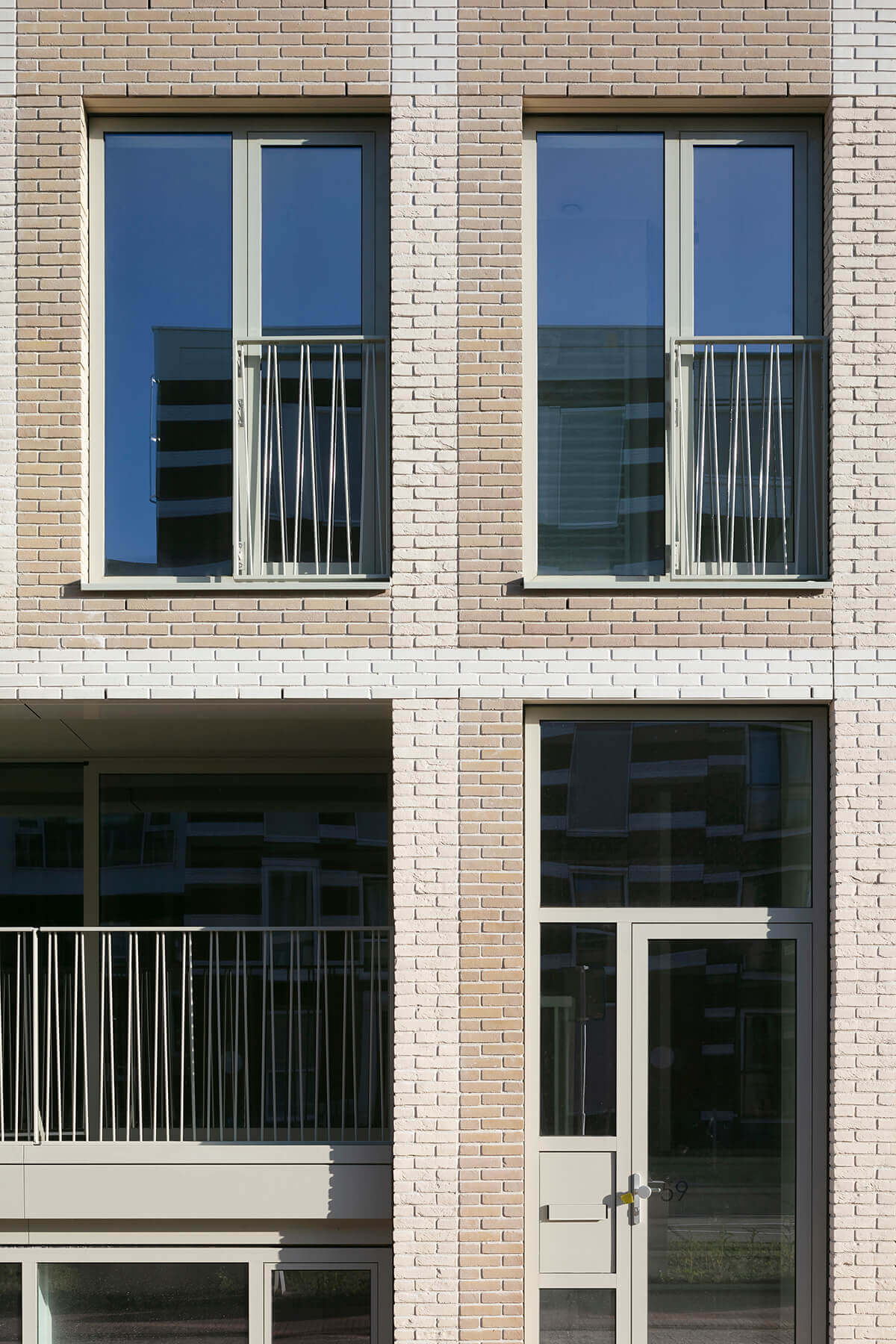
The homes in EnBloc are slotted together like Tetris blocks, but you don’t see that at all when you look at the exterior façade. “That’s what makes the project so much fun. When you ring someone’s doorbell, you don’t know what to expect. Is the apartment two floors high, or three maybe? Is it shaped like an L, or a U? Does the apartment extend off to the left or to the right? That makes the building exciting and interesting. And something else I find important: you move somewhere where you have known your neighbours for five years. This co-creation element in the design process creates social cohesion. As far as I’m concerned, it should be mandatory in new construction projects.”
Laura’s black box
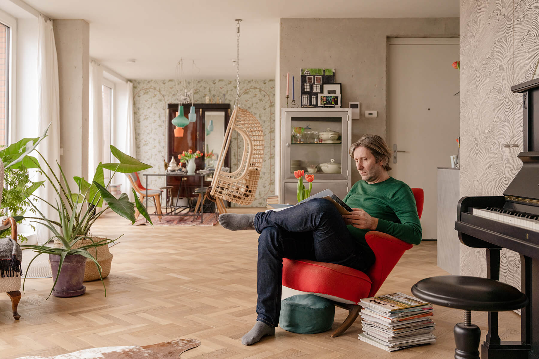
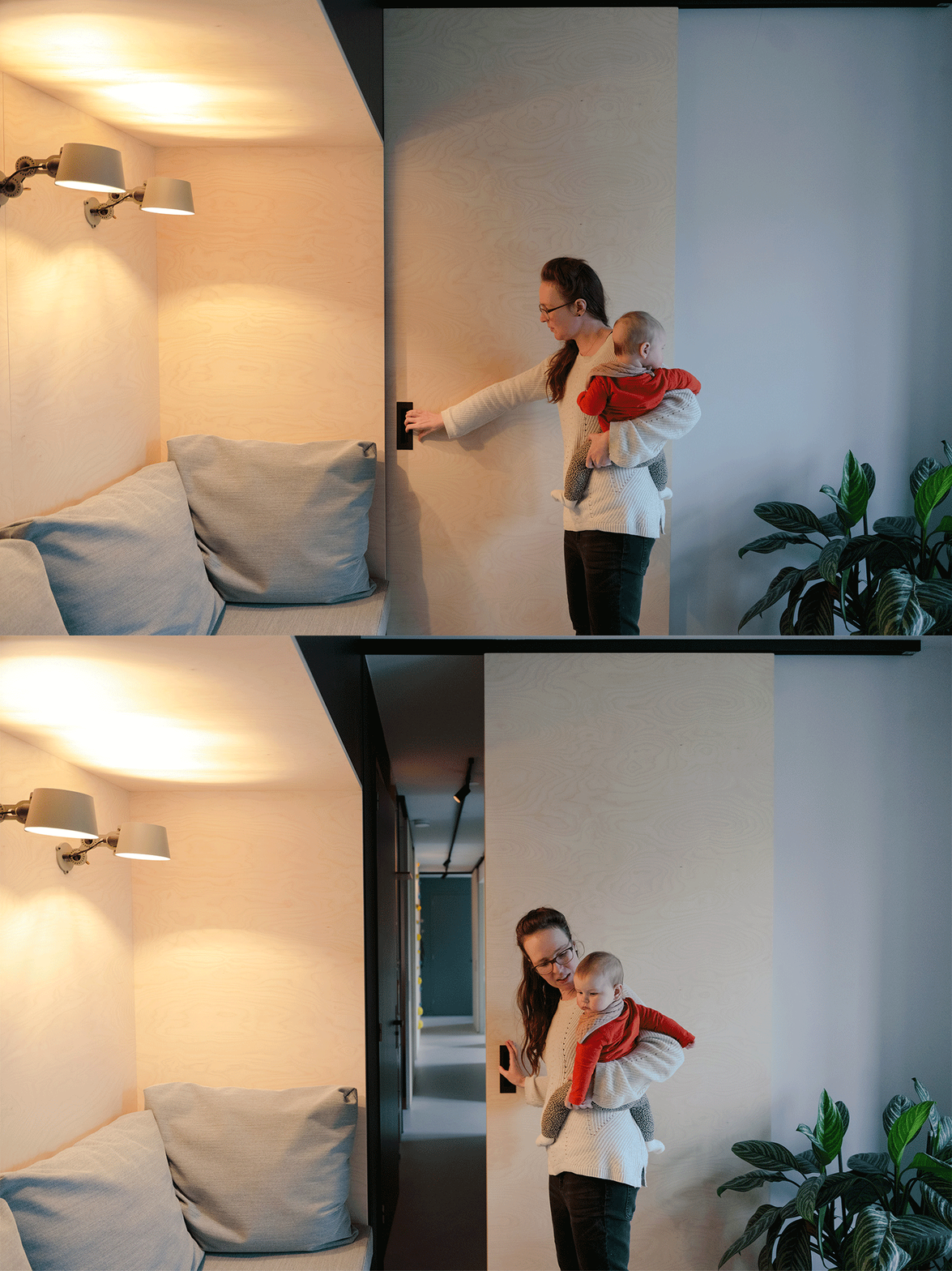
Open, that is the key word that describes Laura’s fourth-floor apartment. “We wanted to be able to slide everything open and turn it into one big family home. When our Italian relatives come over, we don’t want to hide them away in an attic. They are part of our lives and our living space. The idea of openness, and still being able to be together, appealed to us greatly. The sliding walls can be used to create spaces you can withdraw to if you need to. This was also one of our reasons for choosing quite a large apartment measuring roughly 130 m2. We had a lot of ideas and getting things the way we wanted them was quite challenging. The design is playful, as you would expect with young children around. For example, we have a climbing corridor with a swing and a climbing wall near the bedrooms. The house is full of alcoves, hatches, small walls and doors where everything is kept out of sight. We don’t have any free-standing cupboards and cabinets, everything is built in. Even the space where we hang our coats. This place is a paradise for someone who wants to have everything stored out of sight in their home. It always looks tidy and practical. We love that.”
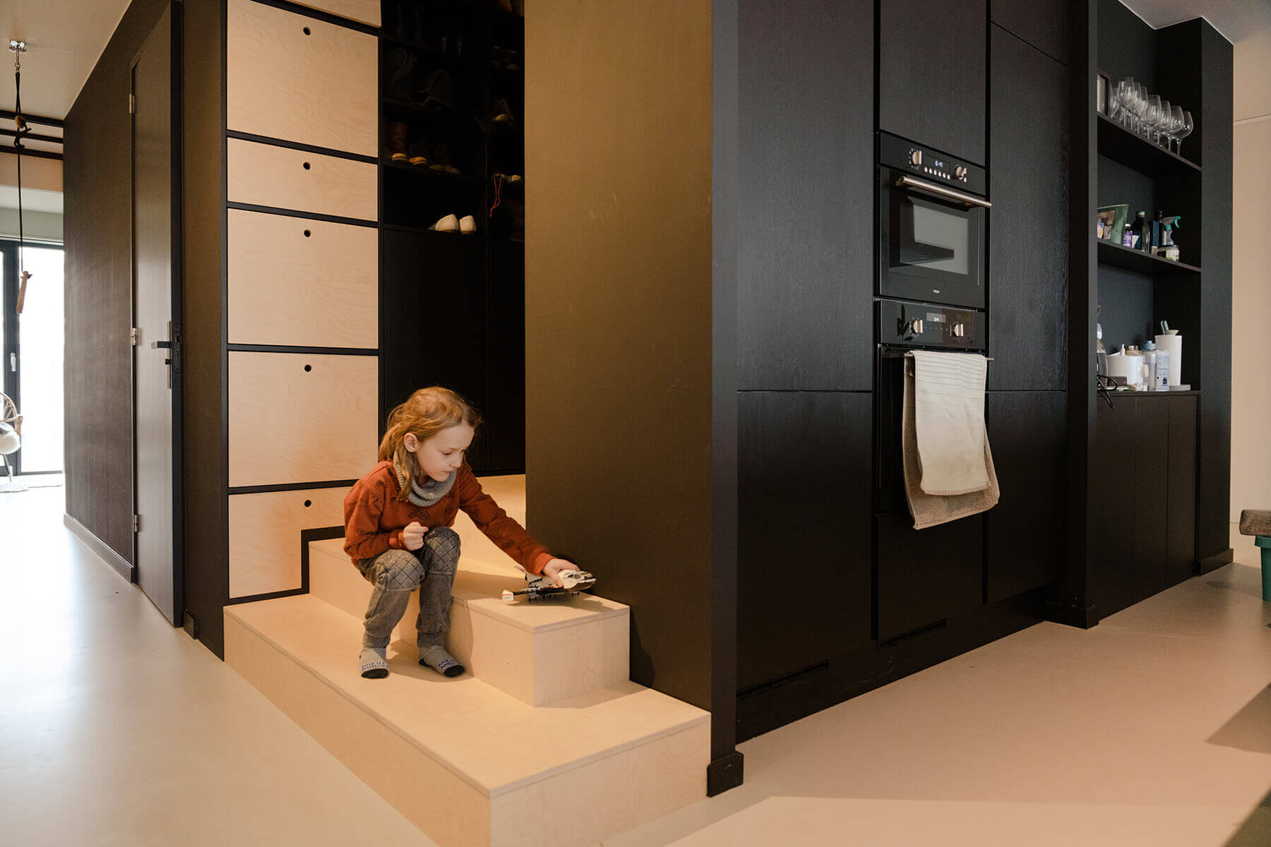
Laura and her husband work full-time from home. “When we’re not working, we slide the study walls open and use it as living space. Even the bedrooms have sliding walls. The guest room has a folding bed that can be completely hidden away. When we slide the doors open, you don’t see anything. This approach helped us incorporate four bedrooms, a study and a living room in the floor plan. The core of the house is a black block containing the kitchen, bathroom, toilet and lots of storage space. You can walk all the way around it. That was a specific requirement for designing the rest of the house.”
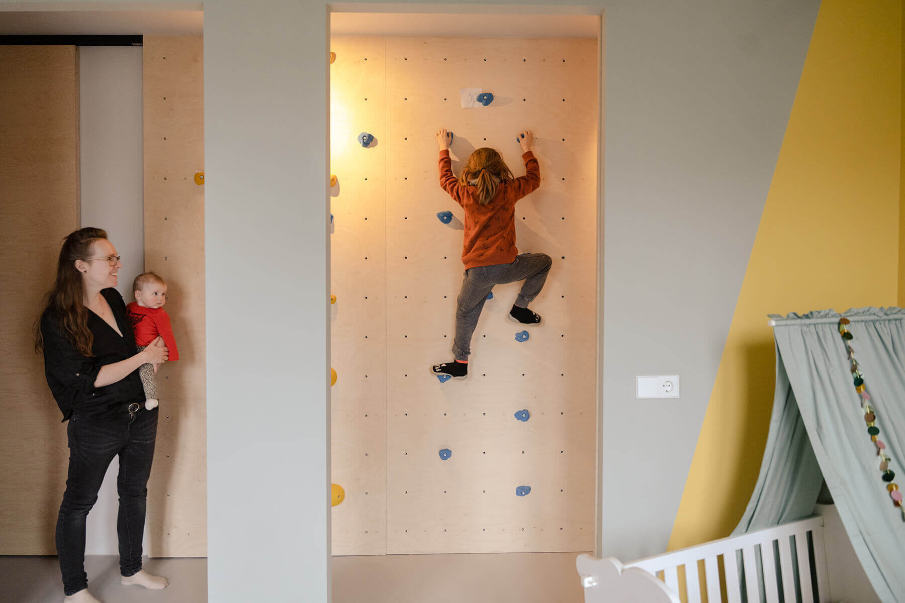
What Laura likes best is that she lives in a house that she has personally designed. “You stand in your home and think: ‘Wow, this is our dream home with all the crazy ideas we could think of.’ We are proud of ourselves as the ‘builders’. Marc Koehler’s design principles gave us the opportunity of laying out our own home with almost total freedom within the basic framework. And help and advice was always available during construction. We and all the other residents put in the time and effort required to achieve this. That community feeling is what makes this project so unforgettable for us.”
